
Can you recall the shrunken version of a desktop site on your phone, where you have to pinch and zoom to see anything? It was likely not an optimal experience!
Because of this, back in 2015, Google rolled out a change to the search engine algorithms which now factor in a website’s mobile presence as a ranking signal. The date was aptly named Mobilegeddon. This reason alone can justify why responsive design is important!
Simply put, a website needs to be user-friendly on a smartphone.
If it is not, your brand may be losing out on leads and sales.
In fact, 40% of users have gone to a competitor’s website after a poor mobile experience.
A responsive website changes the layout to offer an experience based on the device being used, especially ideal for mobile viewing.
A mobile responsive website includes design elements such as:
Did you know the number of smartphone users internationally surpassed 2 billion in 2016?
Websites not optimized for all these smaller screens can experience a decline in their search engine rankings. This means that they are not getting found online.
It’s true that over 60% of searches online now come from a mobile device.
To ensure your website offers an experience tailored to handheld devices (without creating a separate app), consider why responsive design is important as a mobile solution.
Source: Volusion
Let’s get into the details about the why and how.
First of all…what the heck is mobile responsive design and why should you care?
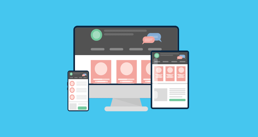
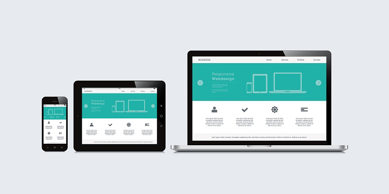
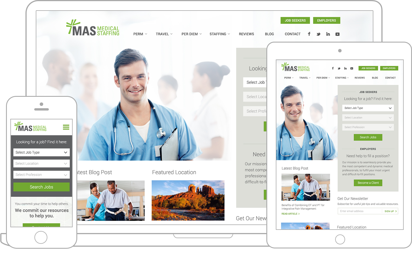
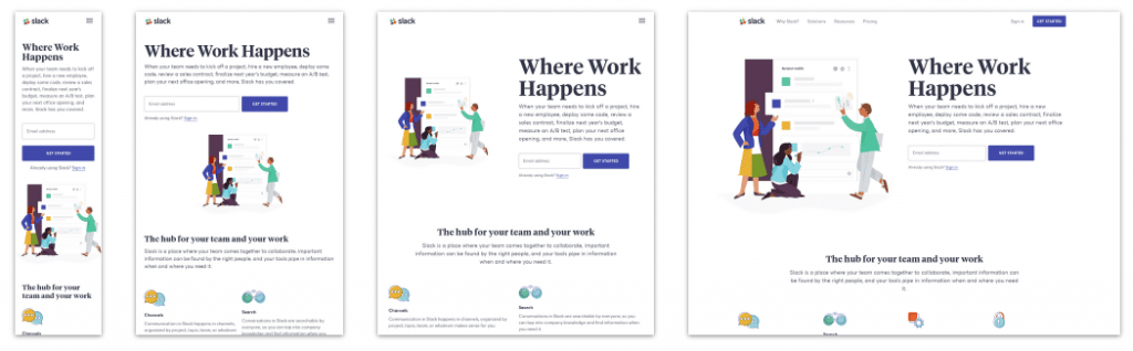
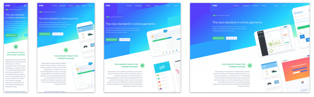
Responsive web design (RWD) creates a system for a single site to react to the size of a user’s device—with one URL and one content source. A responsive website has a fluid and flexible layout which adjusts according to screen size.
The importance of responsive web design is that it offers an optimized browsing experience.
Basically, your website will look great and work well on a desktop (or laptop), a tablet, and a mobile phone’s browser.
Get this:
In the past, developers built more than one site in order to accommodate different screen sizes. With the number of device types out there on the market today, this seems completely inefficient…right?
Now you can understand why responsive web design is not a shiny trend anymore, but more of a shift in the thinking behind building websites. The term was actually coined in 2010 by web designer Ethan Marcotte.
“Responsive web design offers us a way forward, finally allowing us to design for the ebb and flow of things.” -Ethan Marcotte
Having a mobile responsive website is not just another option—it’s a requirement!
The number one benefit of a responsive layout is the guarantee that any user on any device will have the best experience possible on your website. And, the most consistent.
Website responsiveness is also a great way to refine the content on your site, making sure that people using a mobile device are only seeing the most essential information.
With the Google algorithm update, a responsive web design increases visibility on search engines—because it is mobile-friendly. A site with an effective mobile experience will show up in search results above one without.
Note, that there are two other methods by which to offer a mobile-friendly experience. The first is called Dynamic Serving, which uses the same URL but different HTML and CSS code. Pages recognize the device they are viewed on, and serve up the correct code.
The second method, is a separate mobile site altogether. When users visit on a mobile device, they are sent to a different mobile-specific URL.
As long as the correct steps are taken to optimize fully for mobile users, the most useful method really depends on any given situation. Figure out which works the best for your online presence, before diving into it.
Google accounts for over 5.7 billion searches conducted on the web daily.
The Google-recommended configuration for smartphone-optimized sites is responsive web design.
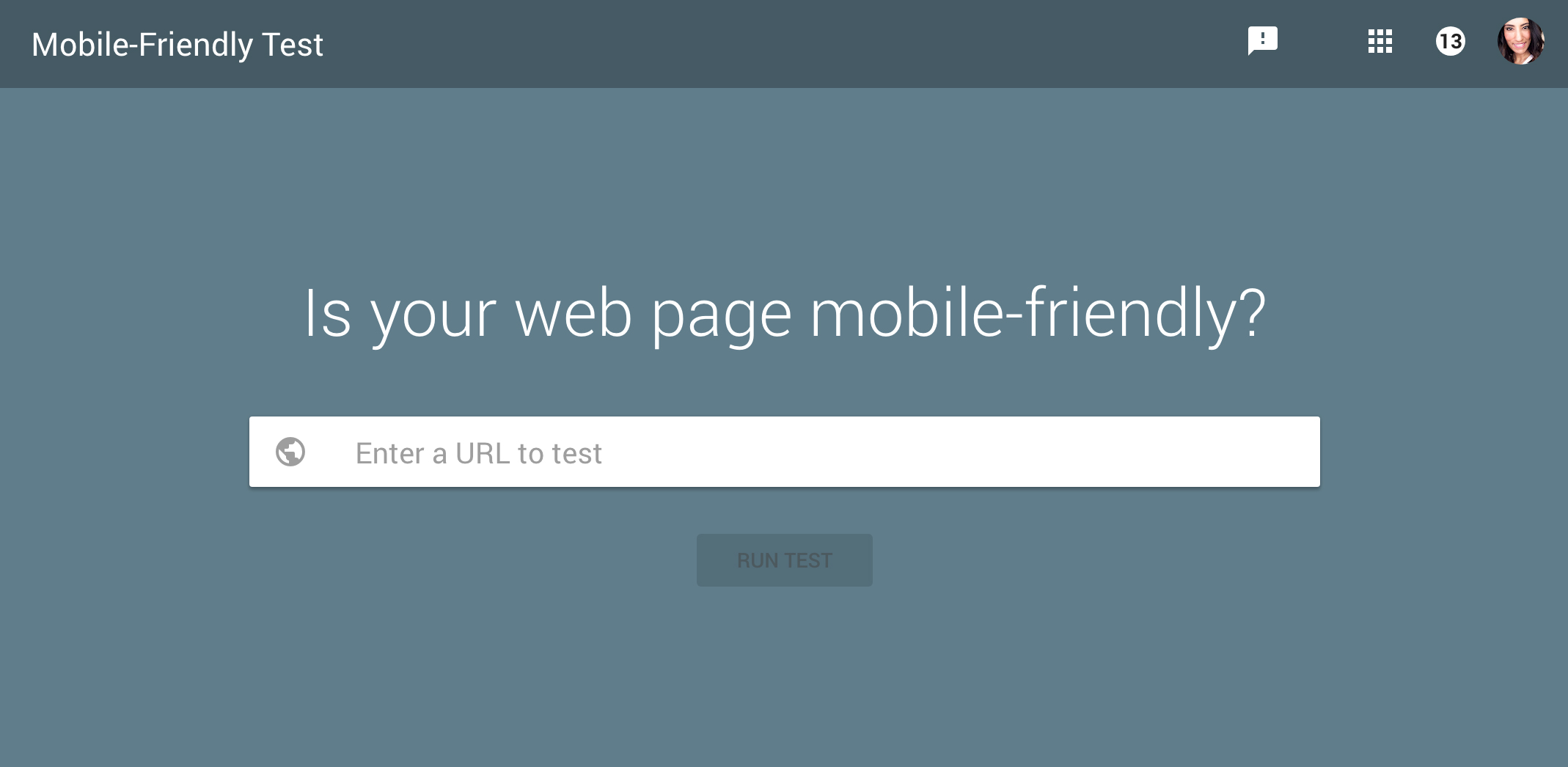
Google even offers a mobile responsive test, so that you can see how easily a visitor is able to use your page on a mobile device. You simply enter a page URL and receive a score.
Can you recall the shrunken version of a desktop site on your phone, where you have to pinch and zoom to see anything? It was likely not an optimal experience!
Because of this, back in 2015, Google rolled out a change to the search engine algorithms which now factor in a website’s mobile presence as a ranking signal. The date was aptly named Mobilegeddon. This reason alone can justify why responsive design is important!
Simply put, a website needs to be user-friendly on a smartphone.
If it is not, your brand may be losing out on leads and sales.
In fact, 40% of users have gone to a competitor’s website after a poor mobile experience.
A responsive website changes the layout to offer an experience based on the device being used, especially ideal for mobile viewing.
A mobile responsive website includes design elements such as:
Did you know the number of smartphone users internationally surpassed 2 billion in 2016?
Websites not optimized for all these smaller screens can experience a decline in their search engine rankings. This means that they are not getting found online.
It’s true that over 60% of searches online now come from a mobile device.
To ensure your website offers an experience tailored to handheld devices (without creating a separate app), consider why responsive design is important as a mobile solution.
Source: Volusion
Let’s get into the details about the why and how.
First of all…what the heck is mobile responsive design and why should you care?
Responsive web design (RWD) creates a system for a single site to react to the size of a user’s device—with one URL and one content source. A responsive website has a fluid and flexible layout which adjusts according to screen size.
The importance of responsive web design is that it offers an optimized browsing experience.
Basically, your website will look great and work well on a desktop (or laptop), a tablet, and a mobile phone’s browser.
Get this:
In the past, developers built more than one site in order to accommodate different screen sizes. With the number of device types out there on the market today, this seems completely inefficient…right?
https://youtube.com/watch?v=snQp757_Rr0%3Fcontrols%3D0%26enablejsapi%3D1%26origin%3Dhttps%3A
Now you can understand why responsive web design is not a shiny trend anymore, but more of a shift in the thinking behind building websites. The term was actually coined in 2010 by web designer Ethan Marcotte.
“Responsive web design offers us a way forward, finally allowing us to design for the ebb and flow of things.” -Ethan Marcotte
Having a mobile responsive website is not just another option—it’s a requirement!
The number one benefit of a responsive layout is the guarantee that any user on any device will have the best experience possible on your website. And, the most consistent.
Website responsiveness is also a great way to refine the content on your site, making sure that people using a mobile device are only seeing the most essential information.
With the Google algorithm update, a responsive web design increases visibility on search engines—because it is mobile-friendly. A site with an effective mobile experience will show up in search results above one without.
Note, that there are two other methods by which to offer a mobile-friendly experience. The first is called Dynamic Serving, which uses the same URL but different HTML and CSS code. Pages recognize the device they are viewed on, and serve up the correct code.
The second method, is a separate mobile site altogether. When users visit on a mobile device, they are sent to a different mobile-specific URL.
As long as the correct steps are taken to optimize fully for mobile users, the most useful method really depends on any given situation. Figure out which works the best for your online presence, before diving into it.
Google accounts for over 5.7 billion searches conducted on the web daily.
The Google-recommended configuration for smartphone-optimized sites is responsive web design.
Google even offers a mobile responsive test, so that you can see how easily a visitor is able to use your page on a mobile device. You simply enter a page URL and receive a score.
SEE ALSO: 5 Most Common Web Design Mistakes to Avoid Right Now44% of Fortune 500 companies are not mobile-ready at this time!CLICK TO TWEET
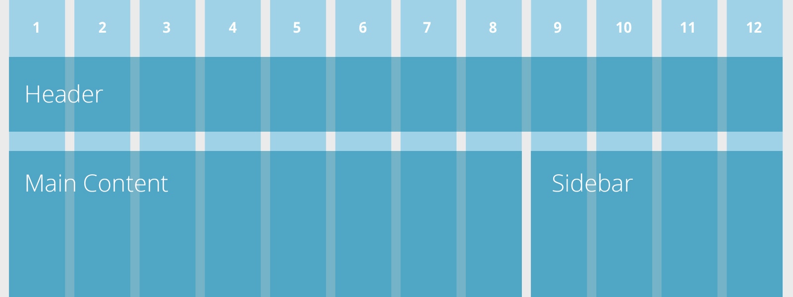
There are a number of things to think about when creating a responsive layout. It is a process that requires a design system and hierarchy of content across devices.
The three main components of a responsive web design include:
I’ll explain each further.
The grid is a crucial element for creating a responsive layout.
Now, grids aren’t anything new.
Web designers have used grids for building websites since the beginning. However, in the past, these grids were fixed width and didn’t lend themselves to support a fluid website layout.
A fluid grid used for responsive sites will ensure that the design is flexible and scalable. Elements will have consistent spacing, proportion, and can adjust to a specific screen-width based on percentages.
The most common screen sizes for responsive design are:
Large desktop
1220 px and more
Desktop
960 – 1219 px
Tablet (Portrait)
768 – 959 px
Mobile (Wide)
480 – 767 px
Mobile
479 px and less
With a fluid grid, users will have the best experience on whatever screen they view your responsive website on.
The way to display text varies depending on what device a user is viewing your site on, but it should be readable no matter what. On mobile responsive websites, there is an opportunity to increase font size and line height (the spacing between each line of text) for legibility.
Flexible text and images adjust within a website layout width, according to the content hierarchy set with the CSS (stylesheet). Text can now be legible regardless of the end user’s device. With a flexible container (within the grid), text can wrap with an increase in font size on smaller devices.
Flexible images can prove to be more challenging because of load times on smaller device browsers. But these images can scale, crop, or disappear depending on what content is essential to the mobile experience.

This is code that powers the flexibility of a layout on responsive websites. Media queries specify the CSS to be applied accordingly, depending on a device’s breakpoint (for example, iPhone portrait orientation or iPad landscape orientation, etc.).
Media queries allow for multiple layouts of a design, which use the same HTML-coded web page.

There are other areas that can help define and refine responsive web design for mobile.
Take a look:
The information about how users interact with your site is invaluable and worth investing in, to create an optimal experience for them.
There are many ways you can conduct user testing to get the most useful feedback possible.
Sites like Peek or UserTesting.com provide user testing for a small fee, or free. Unconventional methods such as in-the-wild testing and card sorting can also help discover unsuspected pain points.
Make sure a responsive design layout is compatible with all relevant browsers and retains the integrity of your user experience & design.
Don’t rely only on dragging the browser in and out to test a responsive web design for mobile; try viewing a site on as many physical devices as you can.
You’ll be surprised at what may be uncovered from one operating system to the next.
As with any design project, find other responsive websites that execute responsive web design in creative ways.
This can be as simple as thinking about the following questions:
Finding answers to these questions can help you find pain points that you may have never noticed during your everyday browsing.
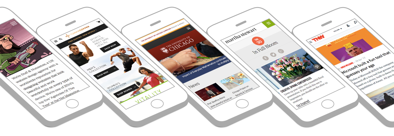
One of my favorite sites to check out responsive design best practices on the web is Media Queries. The site is a collection of inspirational websites using media queries and responsive web design, curated by Eivind Uggedal.
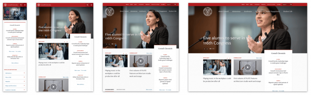
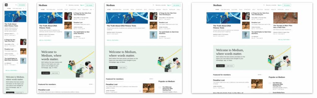
Check out some of these responsive website design examples.
We know that Google is requiring the following optimized elements for an effective mobile-friendly user experience using responsive web design:
The rise in mobile devices is only the beginning of a shift to more convenient web usage. It’s necessary to make sure your website can be viewed anywhere by your users on any device, as wearables such as smartwatches become more popular.
You can easily test to see if your website is responsive, by checking on Google’s helpful tool.
Take the Google responsive test now, to find out where your site stands. Test Your Site
Did you get a green light? Excellent, your website passes the Google responsive test. You may already know why responsive design is important for your website users.
Seeing big red X’s? Start taking the steps towards an online strategy that includes an optimized experience for mobile users. Remember, the changes to Google and responsive design do not affect tablets at this time, but with responsive web design, you’ll be ahead of the game when they do!
Nowadays your website needs to look great and work well on a desktop, a tablet, and a smartphone’s browser. A responsive web design can help achieve this.
This article answers the question, “what is a responsive design?”. There are three components of a responsive web design: fluid grid, flexible text and images, and media queries.
Remember the importance of responsive web design for your business. It helps you:
Google drives 96% of mobile search traffic and recommends responsive design as a best practice. Because responsive web design is mobile-friendly, it helps increase visibility on search engines, which in turn can mean more visitors to your website.
More traffic results in better lead generation, added conversions and increased sales—three big reasons why you need a responsive web design!
Share your comments below!
DexCloud is a branding agency offering brand strategy, website design, and digital marketing services. We can help you build a responsive web design, and ensure your site is ranked on Google. Contact us today to chat about your next project.
If you liked this article, please share!
