PROJECT 03
Laneeka Beauty
Creative direction is best defined as an area of brand development that primarily deals with the creative concepts that surround a brand. Part creative and part strategy, creative direction turns ideas into reality in the form of advertising campaigns, logos, and marketing collateral.
Brand identity design is the actual process of creating the logo, color palette, typography, etc. With these definitions in mind, what follows is an overview of the 7 key design elements you need to create a brand identity that is strong, consistent, and attractive.
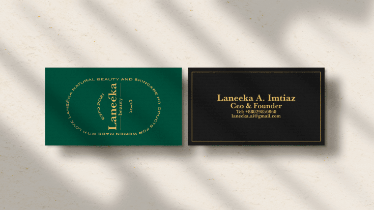
A brand style guide is a rulebook that explains how an organization presents itself to the world through its logo, font and color selections, photography and much more. Put another way, it's a reference tool that helps maintain consistency in what a brand looks, feels and sounds like.
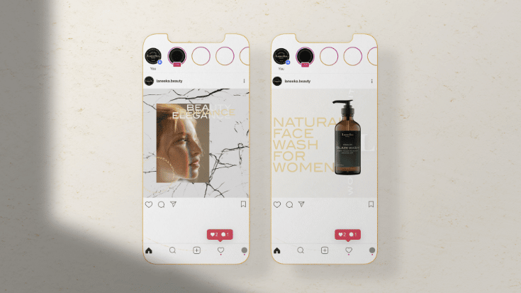
Marketing design applies graphic design principles to the ultimate goals of a marketing effort. It encompasses both the creation of a recognizable visual identity that will appeal to potential customers and the marketing team's deployment of that identity in the form of internally consistent assets.
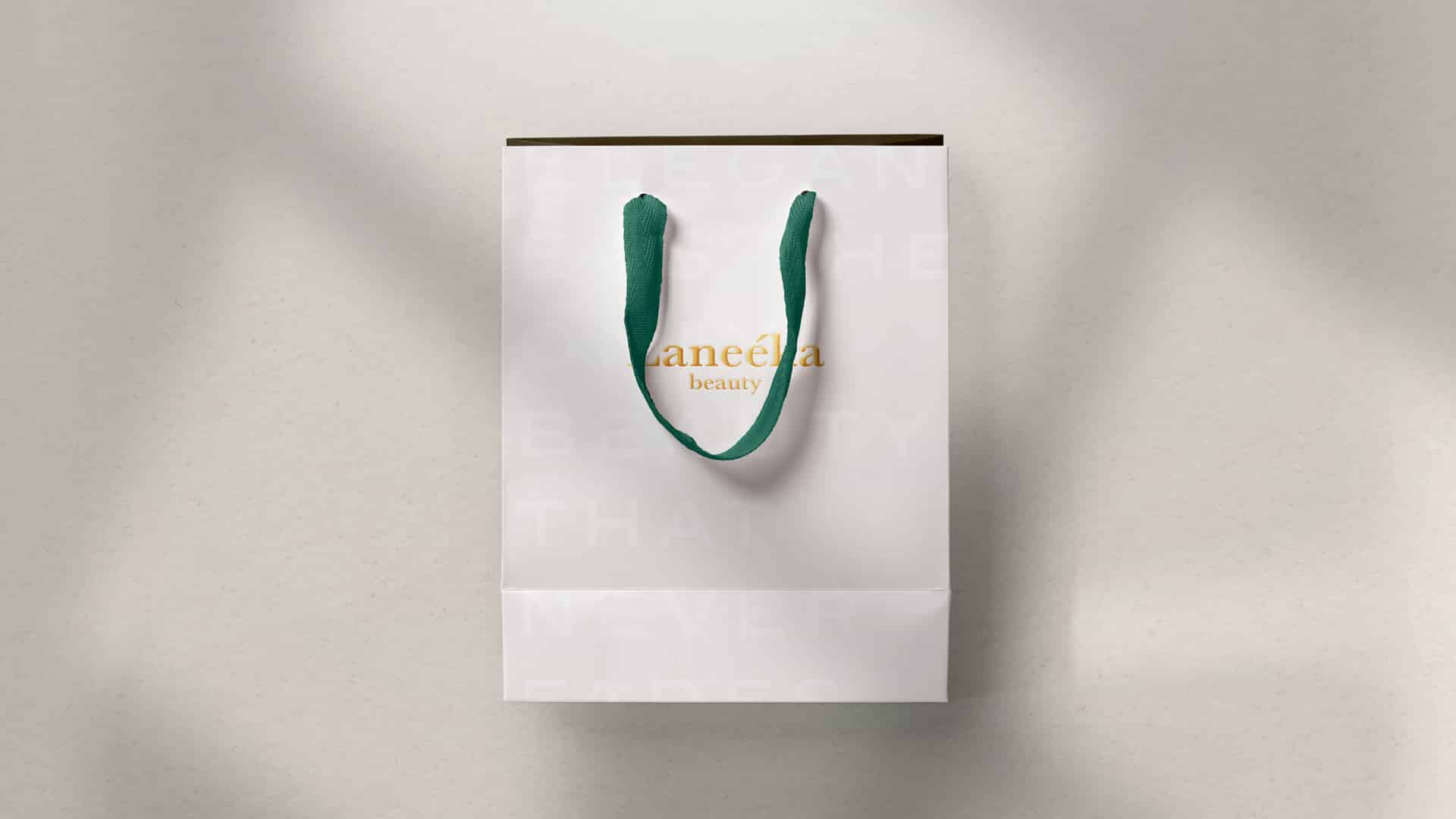
Packaging design is the connection of form, structure, materials, colour, imagery, typography, and regulatory information with ancillary design elements to make a product suitable for marketing.” To put that into a simpler form: Your packaging is an element of your marketing strategy.
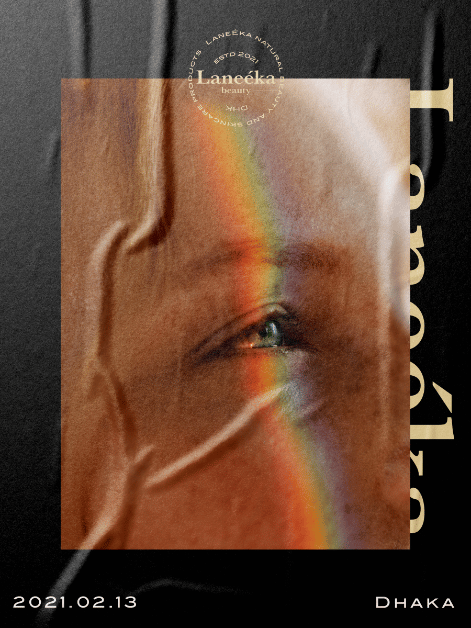
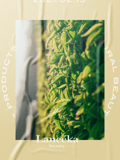
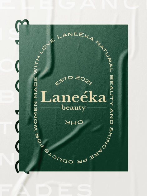
Laneeka is beauty startup brand focusing on creating sustainable natural beauty products. Their line of products green tea extracts & cherry blossom. Currently their products include face wash, moisturizer & Perfume.
Our goal was to establish a sophisticated, elegant and beautiful brand identity. The design needed to be feminine, easy to read details and more importantly a visually pleasing Label & Packaging.
After conducting few strategy session and getting to know its targeted customers and get to know the brand in general, I had to start with creating stylescapes starting creative process, with feedback from fellow designers potential customer base. The outcome was a elegant, pristine and functional design system. With consistent and earthy color tone, typography and Design.

